
Mosquito & Tick
Campaign Redesign
Improving visibility, clarity, and customer response through strategic design.
The original advertisement contained strong messaging, but struggled with readability and visual hierarchy in print.
- Low brightness reduced visibility.
- Cluttered layout created confusion.
- Weak hierarchy hid the key offer.
- CTA competed with surrounding elements.

Brighter, Clearer, More Print-Ready
The existing ad was improved by enhancing brightness, contrast, and readability for better print performance.

Strategic Redesign
We restructured the entire layout to create a clear visual flow, highlight key information, and drive action.

From cluttered and dim to clear, bright, and conversion-focused.
Before
Optimized
Final Redesign
Stronger Hierarchy
Clear visual structure guides attention to the most important details.
Improved Readability
Higher contrast, better spacing, and cleaner typography.
Guided Layout Flow
The layout leads the viewer from headline to offer to action.
Emotional Engagement
Bright imagery reinforces trust, safety, and an enjoyable yard.

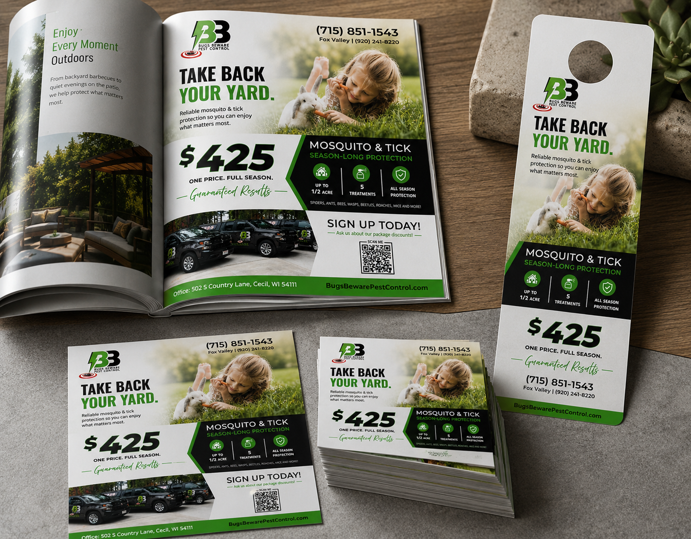

- Print-ready advertisement
- Optimized layout variation
- Campaign-ready assets
- High-resolution files (PNG, JPG, PDF)
Choose the layout to approve
Select the approved version below. Each button opens a pre-filled approval email so the response is clear, quick, and ready to send.
Approve Redesigned Layout
Use this approval for the new redesigned magazine layout with the updated structure, stronger hierarchy, and clearer offer.
Approve Brighter Layout
Use this approval for the original layout with the updated brighter version and improved print visibility.
Both approval paths are separated so there is no confusion between the redesigned layout and the brighter optimized version.